
It seems to me that hip, cultured young people always have some sort of interest in design, whether its architecture, graphic design or web design.
But no form of design seems to have attracted more attention than typography, or the design of letters and fonts. In recent years, it seems like everybody and their dog has an opinion on fonts, whether it’s rage against Comic Sans or, more importantly, the doting admiration of Helvetica.
Somehow over the years, Helvetica has become the font. People praise it for its simple, clean, and utilitarian looks, and the love for Helvetica is so great, that there’s even been a documentary made about the font, the aptly named Helvetica:
With all the fuss over Helvetica, it makes you wonder — do people use it in other languages? Can you write Japanese in Helvetica?
Helvetica proper wasn’t created to write Japanese. After all, it was designed in Switzerland which, as you may already be aware, doesn’t speak Japanese (shocker!).
That doesn’t mean that people haven’t tried, but efforts to design the font for the Japanese language is kind of silly. Even though Helvetica is just a font, a lot would be lost in translation if it was retooled for Japanese.
As one commentor on Quora said, “Helvetica simply has too much cultural baggage that is specific to Helvetica.”
So what does that leave us with? Obviously, the Japanese haven’t exactly been sitting on their hands when it comes to designing fonts. Japanese has its own set of fonts, although none of them are probably as renowned as Helvetica.
But at least one person thinks that they’ve found Japan’s Helvetica: it’s called 新ゴ, or “New Gothic.”
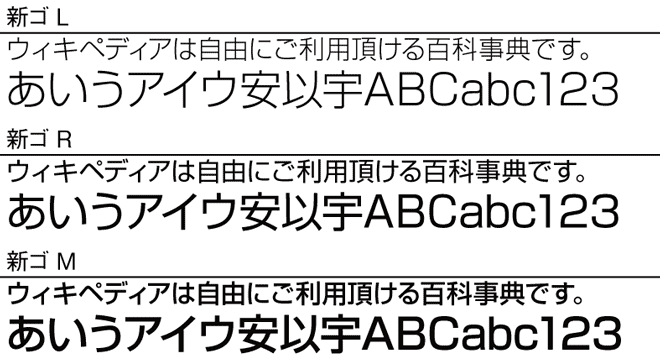
It shares a lot in common with Helvetica: it’s clean, simple, and sans-serif. It’s used in a ton of public signs (just like Helvetica), and was designed by Japanese type foundry Morisawa with Helvetica in mind.
I’m sure there are those of you out there who are so over Helvetica; post-Helvetica, if you will. The font (and maybe its Japanese equivalent) just aren’t cutting it for you anymore.
What else is there in terms of Japanese fonts? As it turns out, quite a lot. Nihongoresources has a pretty good rundown of the different styles of Japanese type.

Probably the most common style is 明朝体, or Minchoutai, a typeface that’s named after the Ming Dynasty. There’s a reason that Minchoutai is named after the Ming Dynasty: it’s kind of old fashioned in a few ways. Minchoutai still has little marks where the brush would rest and lift off, harkening back to a pre-_keitai_, pre-computer, pre-penicil and pen world.
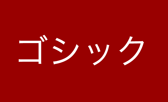
If that’s a little too fancy and old-fashioned for you, then there’s ゴシック, or “Gothic” fonts. There aren’t any marks indicating brush strokes, and all of the lines are pretty much the same width. This is a typeface designed for the modern world, and it’s used a lot in Japan because it’s clear and legible.
Those are the two big ones, but the list goes on and on. Fonts designed after woodblock prints. Fonts designed after name seals (hanko). There are even, just like in English, fonts designed to look like handwriting, including kawaii handwriting.
If you’re impatient, first of all I’m impressed that you’ve read this much (well done!); but second of all, you might be wondering why you should care about any of this. After all, aren’t hipsters and old dudes with perfectly circular glasses the only people who care about typography?

Well, yes, but that should be changing because, as we’ve been talking about for a while now, writing things by hand is slowly going the way of the dodo.
Just last week, a survey by the Japanese government said that more than half of Japanese people say that they’re getting worse at writing kanji because they use their phones and computers more than their pencils and pens.
More and more, you will write Japanese in a font that a company worked hard at for years designing instead of your own handwriting. Is this a bad thing? Not necessarily.
I mean, I can understand being upset that that personal mark is gone from your writing, but look at it this way: People are always a bit apprehensive during big technological shifts; I’ve heard that when writing was first introduced, people were worried that it would give people terrible memories.
But I’m not so worried about a future where you primarily type instead of writing by hand. I mean, it’s kind of cool to think that when you type, you use a font that took a team of professionals years to painstakingly craft; especially considering that my handwriting has probably, if anything, devolved since elementary school.
Now that you have a field guide to Japanese fonts, you can impress those sophisticated 20-somethings at parties. Just don’t tell them that you read it on a website that uses Merriweather.