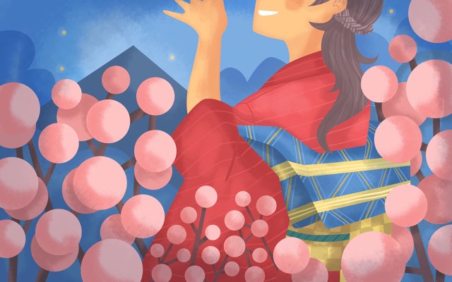
Roses are red, violets are blue, I know all my colors, or at least I thought that was true.
How many colors are there in the world? The human eye has the ability to identify nearly 7 million unique colors, but the color spectrum is limitless beyond the naked eye. With so many colors surrounding us on the canvas of life, it isn't surprising that the perception of color varies from culture to culture. Every culture has its own sense of color, and Japan is no exception. From prehistoric times to the present day, the Japanese have developed their own collection of traditional colors, known as dentoushoku 伝統色 , which are still recognized and used today.
Creating Color Perception
Variations in color perception across cultures are present for a number of reasons, but they mainly concern the influences of geography, internal cultural affairs, and external cultural interactions.
Some traditional Japanese colors have been used since the Asuka period (538 to 710), while others are more recent. Due to the long history of the Japanese color system, some inconsistencies in color and name do exist, but the basic outline of the color system still remains intact, listing nearly 500 individual colors.
First, let's look at the core four!
The Oldest Colors
The earliest written history of Japan, which was a mix of fact and mythology, mentions the four oldest color terms in the Japanese language: aka 赤 or red, kuro 黒 or black, shiro 白 or white, and ao 青 or blue. However, it has been proposed that these terms originally referred to the contrasting optical sensations of light and dark, clear and vague.
With time, these ancient color terms evolved to have the red, black, white and blue meanings in use today (as well as acquiring other symbolic meanings, which we'll get to later). However, traces of the original four colors persist in modern Japanese. Most proverbs and surnames that mention color, for example, often involve these four colors. Additionally, only these four colors can be prefixed with the "pure" and "genuine" ma 真, to give us makka 真っ赤 or bright red, makkuro 真っ黒 or pitch black, masshiro 真っ白 or pure white, massao 真っ青 or deep blue.
Similarly, the original ambiguity of ao appears to have stood the test of time. A vague, overlapping, blue-green color band, termed "grue" in anthropological lingo, may be used to describe the bluish-green (or greenish-blue?) of ao – which is notorious for causing the Western confusion between aoshingou 青信号 and "green traffic light." Or aonegi 青ネギ and "green spring onion."
Geography
Some people think of geography as a somewhat useless, easy-A class in college, but the truth is that geography is one of the most important factors in how we interact with and perceive the world around us. In the case of color sense, a group of people living in the desert would undoubtedly perceive the color green very differently from a group living in lush forest lands, as the Japanese do.
Geography also has to do with color in that it dictates the resources available to people. In Japan, this is especially clear as the names of traditional colors are often related to native plants and animals, especially those used to make pigments and dyes. An example of this would be the Japanese color name, akaneiro 茜色, which was produced by creating a dye from the root of a plant called akane grass. Another perhaps more familiar example is azukiiro 小豆色, or the color of azuki beans (aka the most delicious thing ever, often the filling of daifuku mochi).
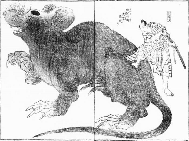
As for colors named after animals, the most popular choice seems to be the mouse, or nezumi, which is used to express grey tones. For starters, you've got budou nezumi ぶどうネズミ, or grape mouse (purple grey). But, the list goes on and on with names like fuji nezumi 藤ネズミ, or Fuji mouse (light purple grey), yanagi nezumi 柳鼠, or willow mouse (light green grey), and cha nezumi 茶鼠, or tea mouse (light brown grey). All I can say is Japan must have a really big rat problem.
You can see more colors along with the explanations for their names (in Japanese) here.
Internal Culture
Now that geography has been taken into consideration, we can look at the internal cultural affairs that have influenced Japan's sense of color.
The beginnings of the traditional Japanese color system can be traced back to the year 603, when Prince Shotoko established the first Twelve Level Cap and Rank System in Japan. Based on Confucian values and the five Chinese elements, this social ordering system determined rank by merit rather than heritage, and certain colors were used as symbols of rank in society, as below:
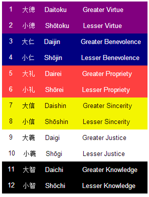
In this system, the use of colors known as kinjiki 禁色 was forbidden; only the highest ranking government officials were authorized to wear robes of these colors. An example of this is the color Ootan which was strictly reserved for use by the kuge 公家, or the Japanese aristocratic class. On the other hand, colors designated as yurushiiro 許し色, or permissible colors, were used by the common folk.
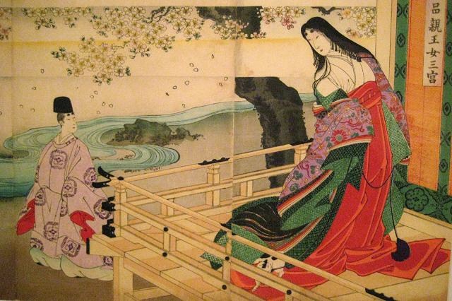
Another period noted for its contributions to traditional Japanese color sense is the Heian period. Stretching from the years 794 to 1185, this era is considered the peak of the Japanese imperial court and is known for its art, especially in poetry and literature. It was during this era that many famous works such as The Tale of Genji were written. The poetry and literature of the Heian period is notably expressive, and many color names and descriptions came about from the pages of these traditional pieces.
External Culture
A third influence on the perception of color within a particular group is the impact of interactions with external cultures. In other words, through the ebb and flow of history, color perceptions are adopted by one culture from another. In the case of Japan, both China and Korea had heavy influences on the traditional colors of Japan early on in history through religious and political ideas. However, in the Meiji era many new colors were adopted in Japan as chemical dyes were introduced through trade with Western countries.
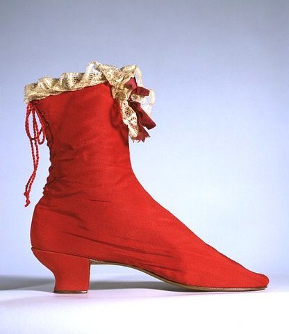
In the 1860's Napoleon III's wife, Empress Eugenie (1826-1920), made popular a new dye called aniline by showing off her flaming red military boots to the public. It wasn't long after that a group of entrepreneurial Germans brought the trendy new dye to Japan. Below is a picture of the boots that started the aniline craze.
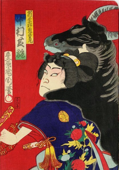
You can tell aniline red dye from more traditional Japanese reds just by looking at it. Traditional Japanese reds were made from natural substances and had the tendency to fade quickly, leaving art historians only able to guess what the original looked like. However, aniline reds stay bright for much longer. Both the Japanese print above and the one below were dyed with aniline red dye. Can you see how overwhelming the color looks compared to older Japanese prints? It almost looks out of place, if you ask me.
If you are interested in the history of aniline red and its presence in Japan, I'd recommend this great post. Of course, there are many more colors now part of the Japanese color system that were adopted from foreign countries. Many of these colors are identifiable by their names which are often written in katakana, such as orenji オレンジ. It seems that many people are stupefied by loaned color words in Japanese and are under the belief that the Japanese didn't have these colors before they were imported. However, it's not that the colors didn't exist. Simply, the names of colors have more to do with their source and the dyes used to produce them, many of which were not present in Japan before the Meiji era.
The Big Four and Their Impact
Let's jump back to those four old colors, shall we? As a civilization develops, so does its notion of religion, social classes, job specialization, and the like. Many cultures have attached meaning to colors that relate to these, and Japan is no different.
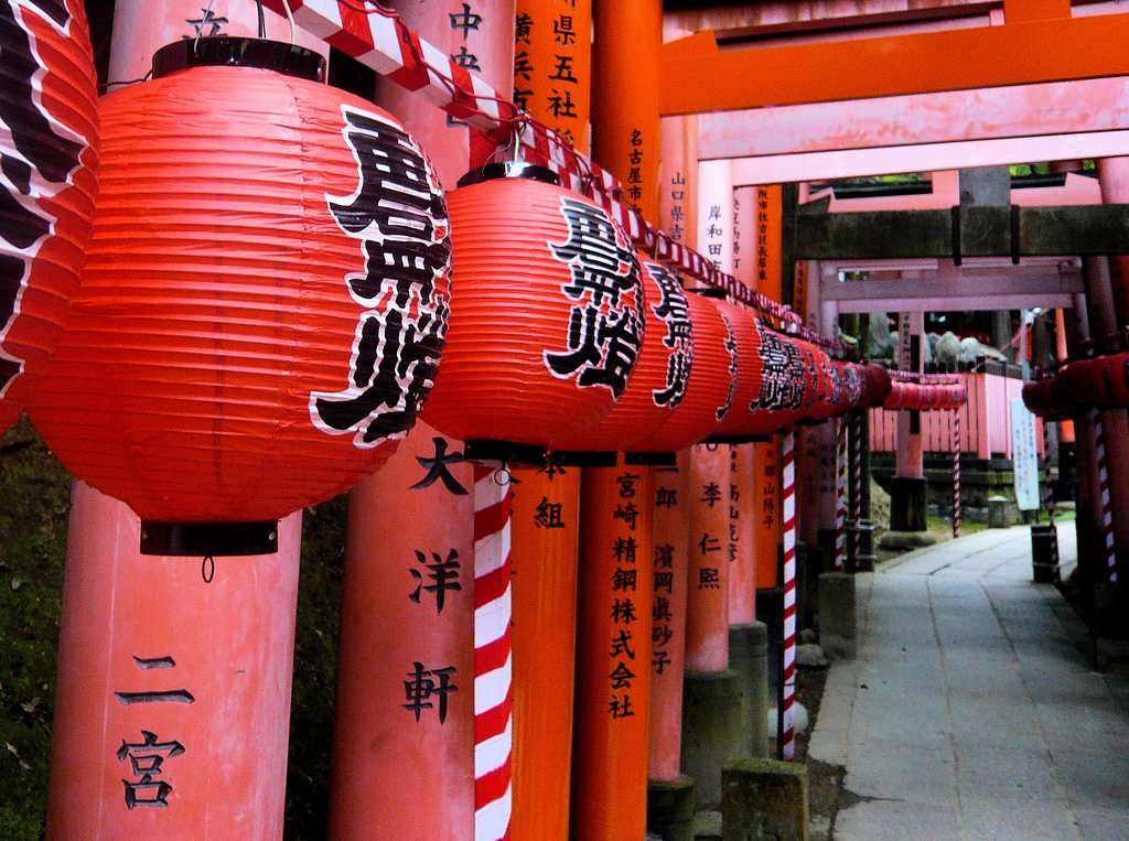
Red came to be associated with authority and wealth, as attested to by red-sheathed samurai swords and ornamental combs. It also has ties to religion, as demonstrated by the red torii of Shinto shrines, whose shrine maidens are traditionally clad in red hakama 袴. White is godly and pure; sacred places are strung with shimenawa 注連縄 festooned with white shide 紙垂, or strewn with white pebbles or sand. Black exudes dignity and formality, and is used for the robes of Buddhist monks, as well as for montsuki 紋付, the kimono that bears the family crest.
Have you noticed that three of the four original colors have some link to religion? Blue, however, has strictly secular connotations. One theory is that because the Japanese never worshiped an all-powerful god dwelling in heaven above, blue never became associated with lofty, religious sentiments.
This does not mean, however, that blue has been left out in the cold. Blue was a popular choice for ceramics, namely sometsuke 染付け porcelain, and fine art, namely the aizuri-e 藍摺り絵 woodblock prints. Blue also formed the basis for the indigo dyeing industry that flourished in Shikoku during the Edo period. The dyers, or kouya 紺屋, were so busy that they hardly had time to dye their own clothing, giving rise to the proverb "The dyer wears white" (紺屋の白袴), which is used to describe anyone too busy attending to the needs of others to attend to his own.
Kimono
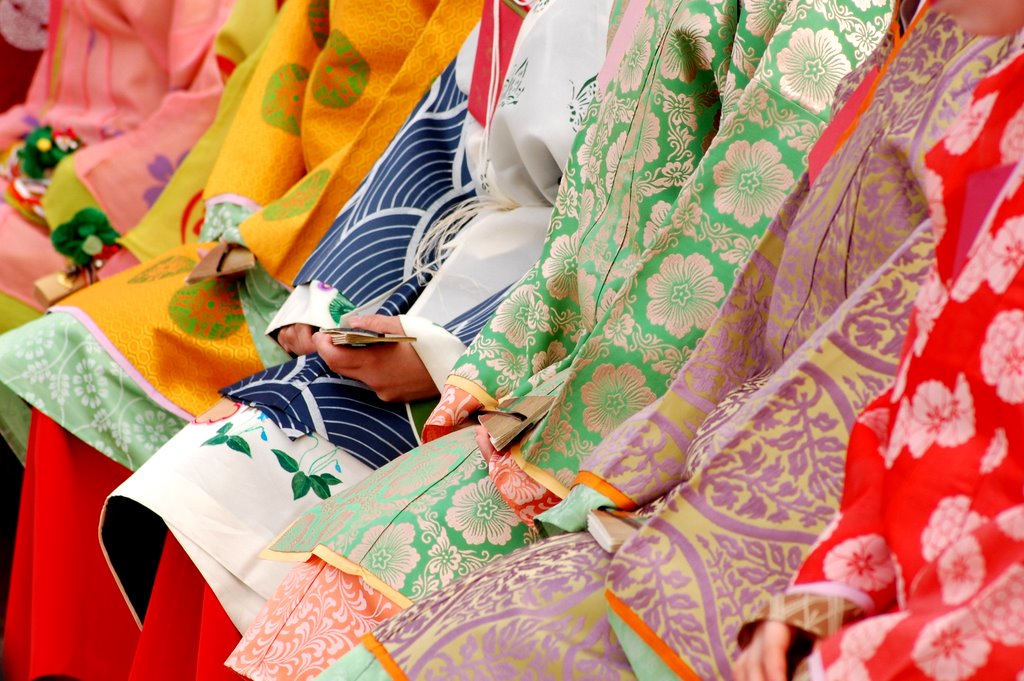
Since we're talking about clothes, traditional Japanese colors have been used in artistic fields for centuries, and kimono is one of the most notable. The colors displayed on kimono are not random. A piece of clothing so expressive it is considered an art must be thought out very cautiously. In fact, the color combinations used on kimono over the centuries have become part of Japanese color sense.
Although not everyone could afford an array of various colored kimono, geisha had the ability to set the fashion standard with their ever changing style. Below is a list of color combinations worn by geisha according to month:
| Month | Theme | Colors |
|---|---|---|
| January | Pine | sprout green and deep purple |
| February | Redblossom plum | crimson and purple |
| March | Peach | peach and khaki |
| April | Cherry | white and burgundy |
| May | Orange Flower | deadleaf yellow and purple |
| June | Artemesia | sprout green and yellow |
| July | Lily | red and deadleaf yellow |
| August | Cicada wing | cedar bark and sky blue |
| September | Aster | lavender and burgundy |
| October | Bush Clover | rose and slate blue |
| November | Maple | vermilion and grey-green |
| December | Chrysanthemum | lavender and deep blue |
Over time, these color combinations have become part of the Japanese color culture and are thought of as being pleasing to the eye.
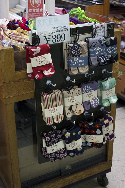
Traditional Colors in Modern Fashion
Ten or twenty years ago, most Japanese young people wouldn't have been caught dead wearing something "traditional" (oh, the shame!). However, these days, things are different. Recently many fashion companies in Japan have been working on reviving an interest in traditional Japanese colors and styles. Now, wearing a kimono to work (in the right setting) is the uber cooliest! In a way, the last decade or so has been sort of a fashion renaissance in Harajuku.
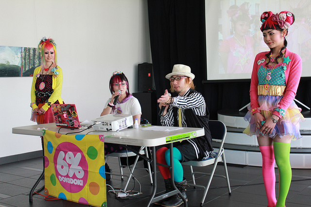
Honestly, I wasn't aware of this fact until three years ago when I attended a presentation by 6%DOKIDOKI, a prominent Japanese fashion company in Harajuku. Not knowing anything about Japanese fashion, I was astounded that nearly their entire presentation revolved around the importance of the traditional Japanese colors in their designs – something I had never even heard of. They spent an hour going through their outfits bit by bit, pointing out each color they included and reveling at the brilliance of their design. As a frumpy mid-class American teenager, I had no idea what they were talking about, but I was amazed nonetheless.
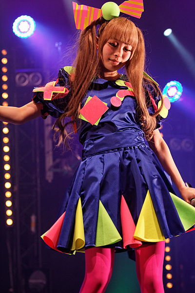
And it's not just Harajuku fashion models that are flaunting the traditional colors of their country. Familiar faces such as Kyary Pamyu Pamyu and other J-pop idols are also rockin' the traditional color trend and showin' their stuff on stage.
It seems that this new trend spurred on by Japanese fashion companies has become a matter of pride for Japanese youth, as they embrace the beauty their country's culture has to offer. With modern technology, you can even download a traditional Japanese color chart on to your phone or other device.
Knowing about Japan's perception of color can tell you a lot about the Japanese people's culture, history, and life, and being able to recognize such colors can bring Japanese works of art and literature to life. In the case of Japan, it is also pertinent to understand if you are interested in modern fashion trends.
If you get familiar with traditional Japanese colors, you'll be sure to impress your Japanese friends because even most Japanese people don't know the names of dentouiro– an added bonus. Do you have a favorite traditional Japanese color? I think mine is azuki iro because MMM azuki beans.